|
|
Post by rennyd on Jul 8, 2013 13:41:17 GMT 8
|
|
|
|
Post by rennyd on Jul 22, 2013 13:57:52 GMT 8
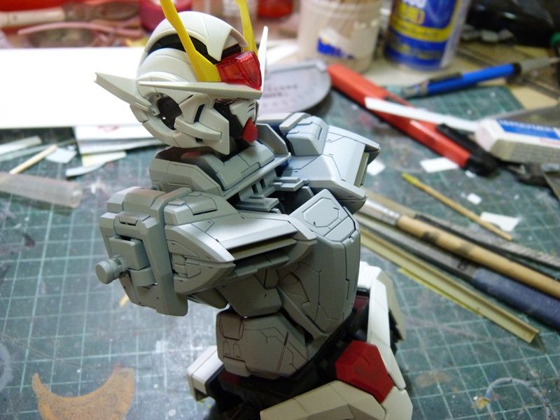
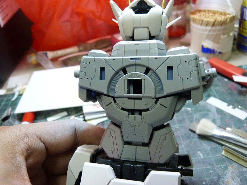
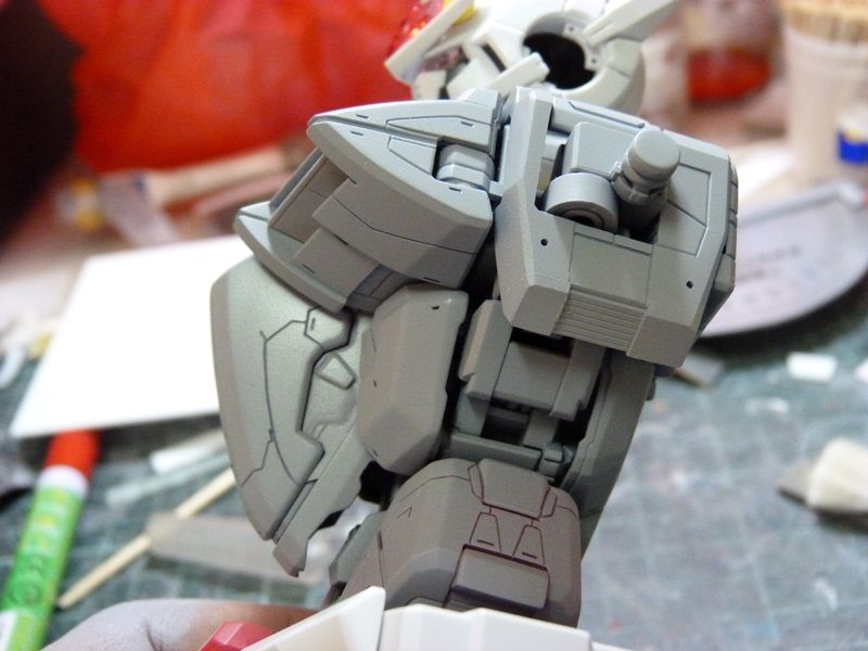
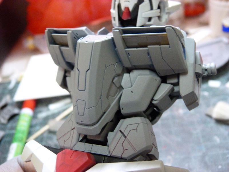
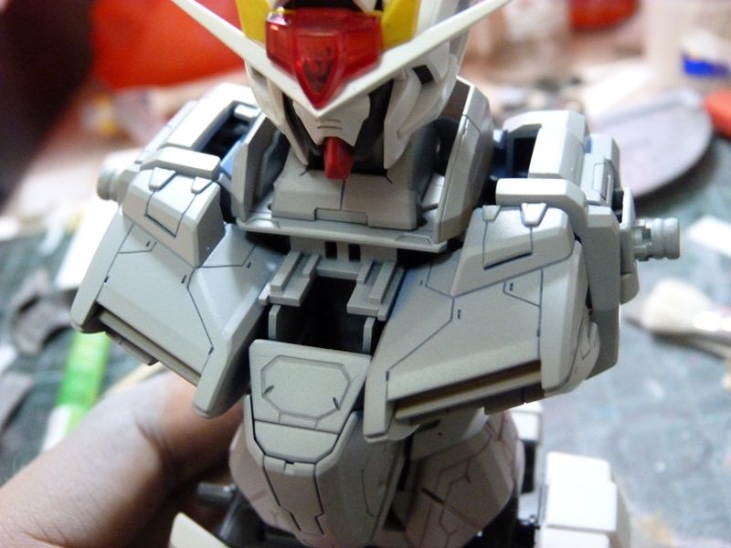
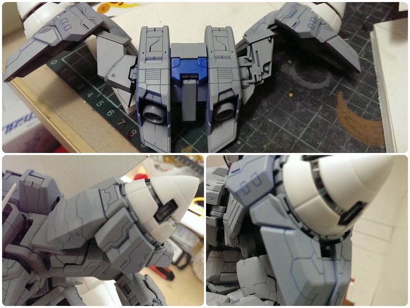
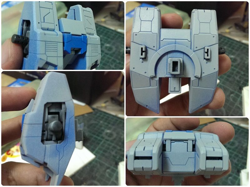
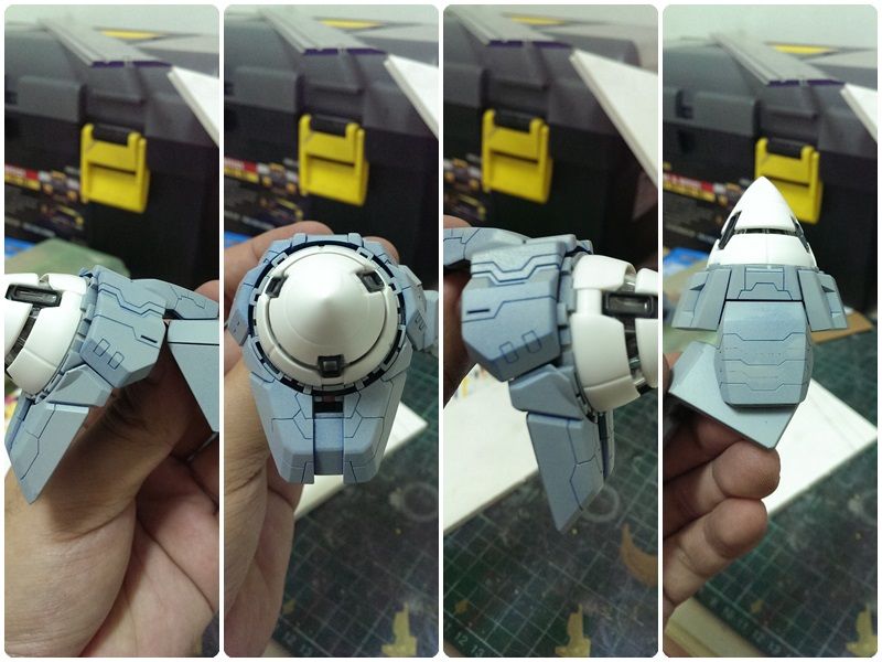
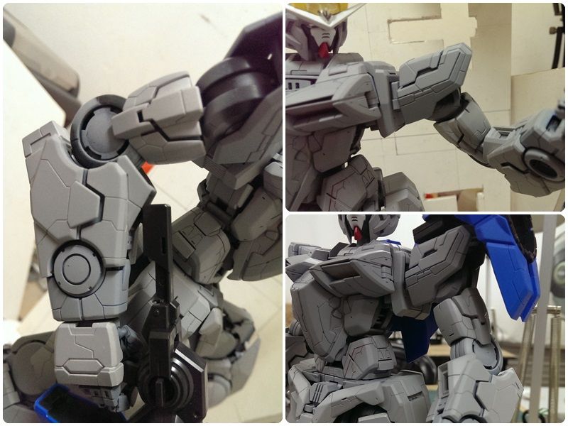
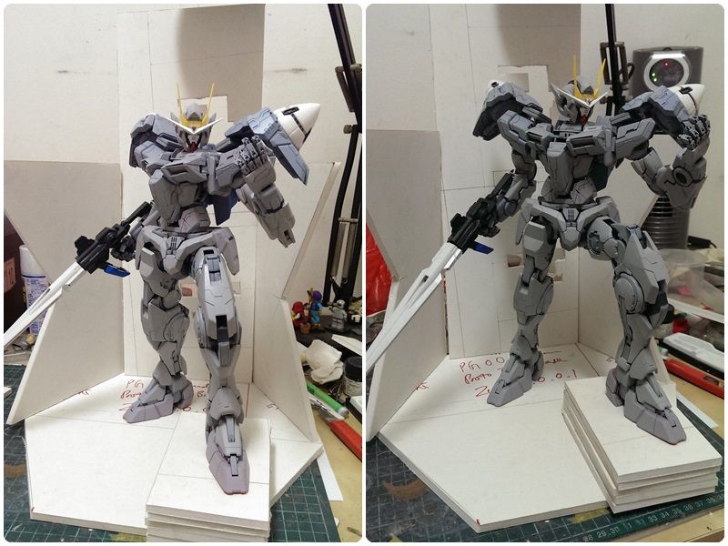
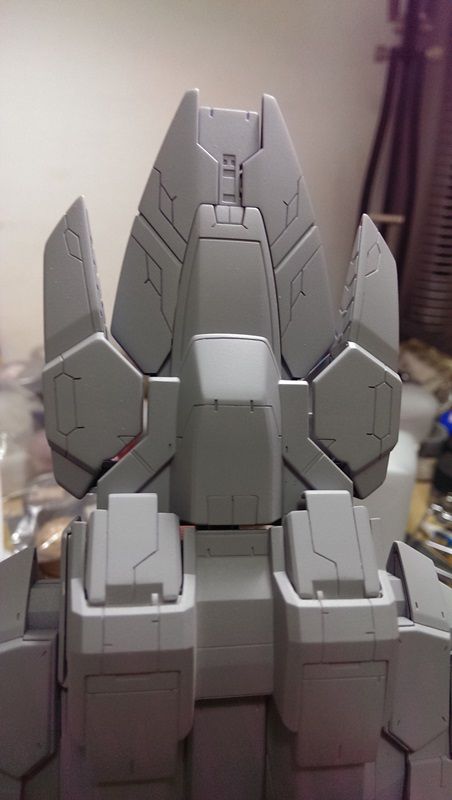
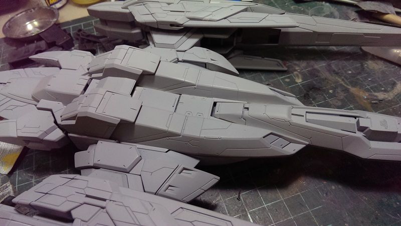
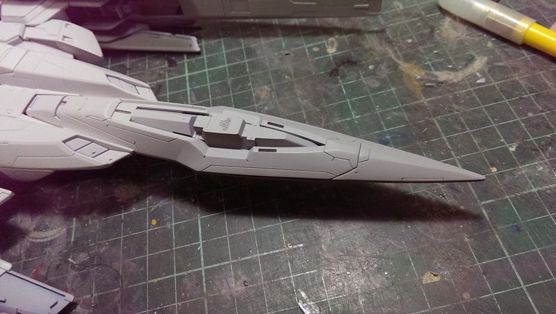
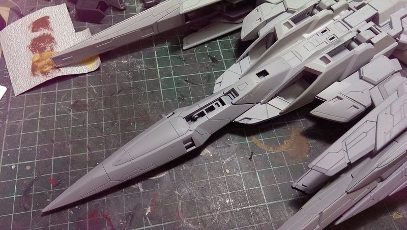
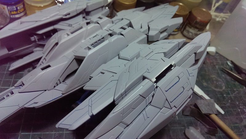
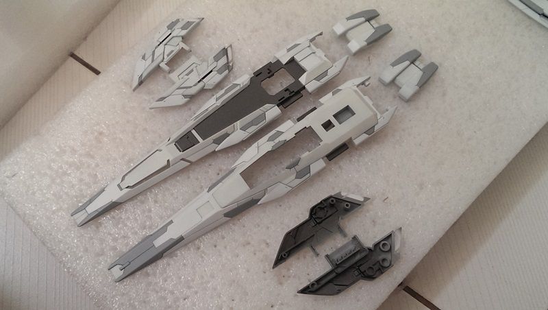
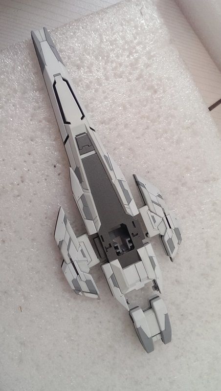
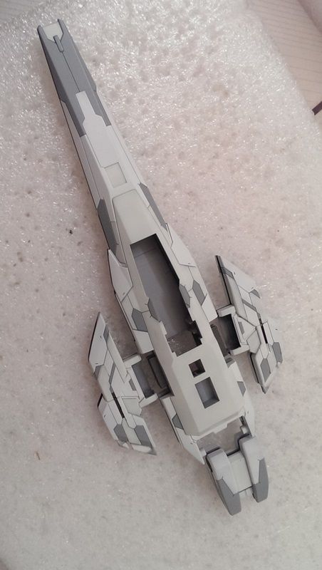
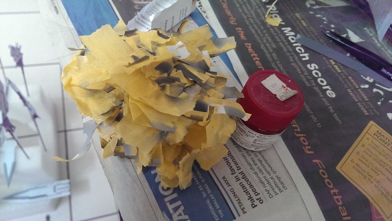
Progress Update 22/07/2013Although it's progressing, but still have a lot to do. So first, the progress so far with some comparison with my previous build. 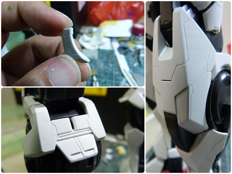 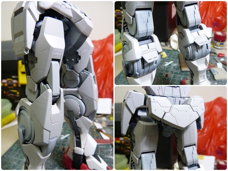 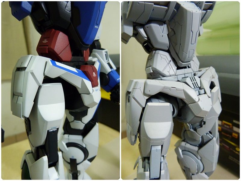 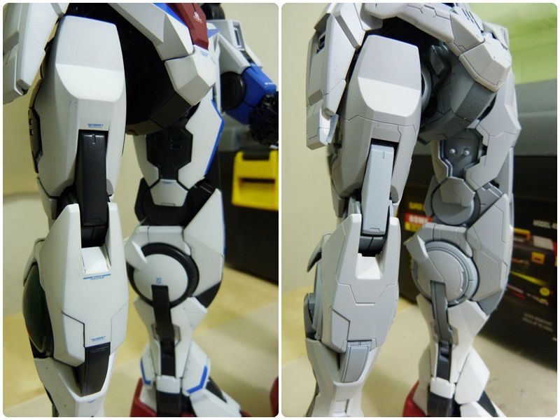 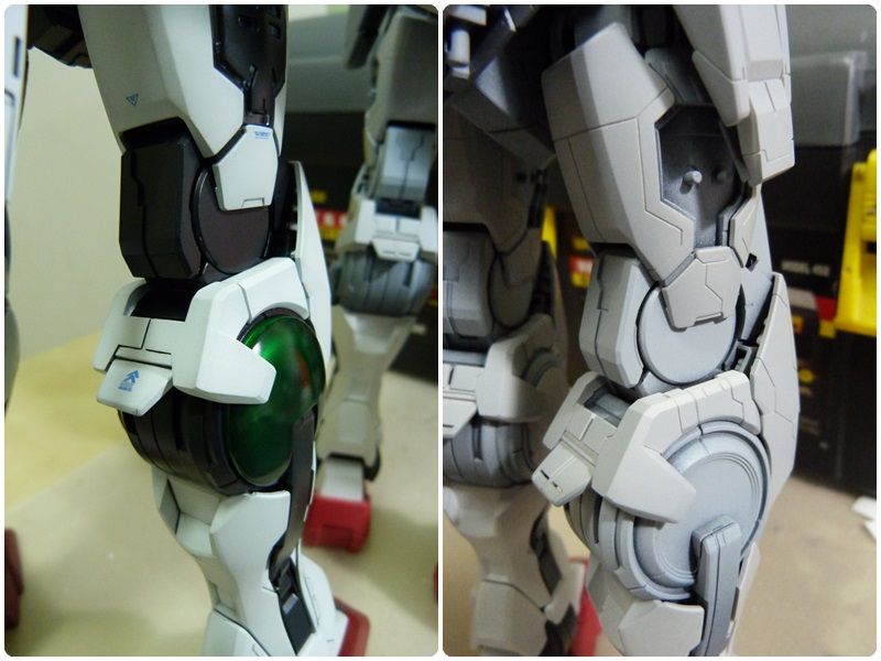 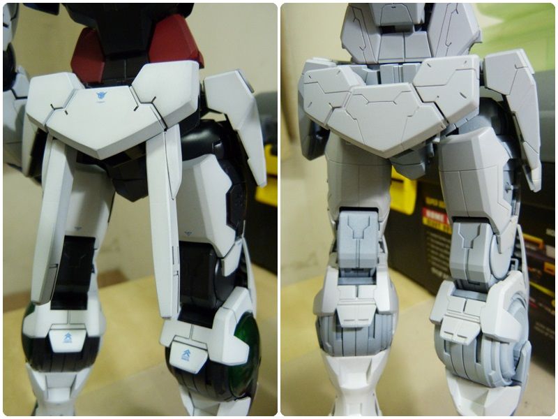 Here's how I did generally with the scribing process, as shown in the following picture. 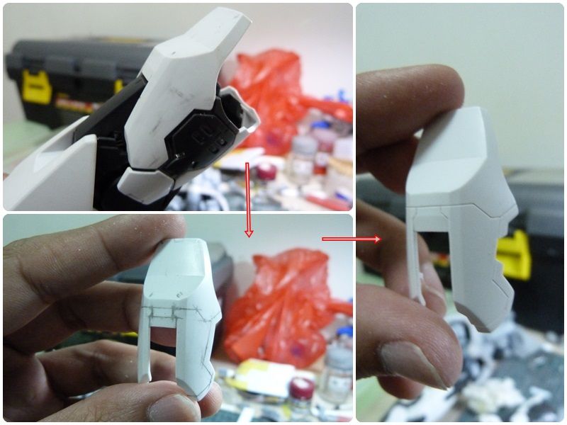 So nothing fancy, just simply using pencil to draw the lines, by imagining the shape of the armor and how each pieces are interconnected with each other to form that one huge piece of armor. After done with the final decision, will proceed to mark the cross point with a needle/scribing needle. Only then will proceed with the scribing of the panel line, first with pen knife + tape as guidance, then with the BMC 0.2mm chisel, then lastly bevel the edge with the pen knife again. The pen knife that I'm using here is the 30 degree blade type pen knife. Apart from that... Usage of SeradanmoYes, this one particularly I would like to share it here. At first I thought that this tool is good at making armor gap. But as demonstrated on Sujibori-Do website, it can be used to scribe panel line as well, esp. the curve type panel line at the side of the armor. Below is a picture of one of the usage, which I used to mark a line at the side of the curve armor, which will then be cut out to form inner curve. 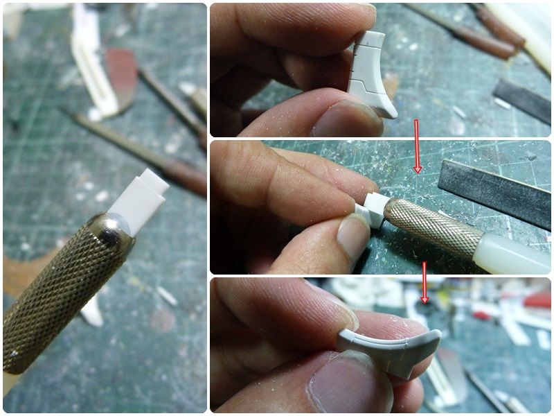 As in the picture in the last pointed arrow, it has managed to mark the line that I wanted. Next, all I did was to cut out that section. The end result is something shown in the first picture at the beginning of this page, with a green capital letter A at the top left corner.
|
|
|
|
Post by darkworkx on Jul 23, 2013 23:42:22 GMT 8
|
|
|
|
Post by rennyd on Jul 24, 2013 13:51:36 GMT 8
darkworkx, thanks for the comment. The one that I have is made of ceramic, which is a discontinued product. The one that you saw is the one that made of tungsten, by BMC, the same maker that makes the BMC Blade Chisel, which is a lot more expensive as compare to the ceramic version.
|
|
|
|
Post by nununu on Jul 30, 2013 5:55:11 GMT 8
nice work ^^
|
|
|
|
Post by rennyd on Aug 19, 2013 12:23:57 GMT 8
|
|
|
|
Post by Rayloke on Aug 19, 2013 13:01:50 GMT 8
Assume the photo on d left is d angle u want present to ur viewer, I think the back look way too symmetrical n safe as to the front. Safe sometimes oso = not confident, not interesting.
Besides the odd shape at d back... If u gonna cut it yourself, high chance acrylic will crack. If ask third party cut, not sure they take d job or not.
Try not show too much of the cutting side of acrylic, instead, show more of d perfect flatness of the acrylic surface. Even if u polish perfectly on d cutting side, unless it has a thickness to shout about, the cutting side with irregular distortion of light, it ain't a pretty sight to present. Wat I mean is vertical will be more visually dominant than horizon. Minimize d cutting side being presented vertically.
Just my 2cents worth.
|
|
|
|
Post by rennyd on Aug 19, 2013 15:20:55 GMT 8
Ray, thanks for the comment. I still remember what you mentioned about the difficulty to cut acrylic, so don't worry, I'll be careful with that (hopefully). I purposely put up those boards there so that I could visualize how the back panel should be like. It won't be like in the pictures 'coz I personally don't like it that way too.
|
|
|
|
Post by rennyd on Sept 12, 2013 11:46:14 GMT 8
Update 2013-09-12Progress so far. Just started the airbrush painting stage with the inner frame first. This time I really underestimated the amount of time needed to setup the parts for painting. It took me 2 hours just to setup the inner frame of the upper and lower body plus the head for painting. But at least the inner frame is going to be one color tone, so it should still be manageable (hopefully). So after 2 days with 6 hours of works, the result is summed in one picture below (taken with my new smart-y phone). 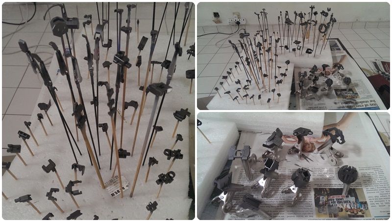 Thankfully my niece was so kind that she's allowed me to use her air compressor (as shown below), which helps a lot because I don't need to wait for it to cool down like my own previous compressor. 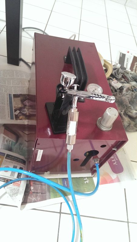 Inner Frame's Color Inner Frame's ColorSo the inner frame color is as follow. Gaianotes EX Silver + Gaianotes Flat Black + little bit of Mr Color Metallic Black + little bit of Mr Color Midnight Blue Now, I tried to mix the color according to my likeness, so there ain't any formula like how much of this and how much of that that kind of stuff. The following is a close up of the result. 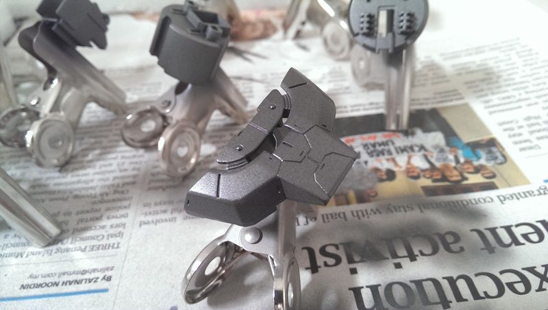 I was quite surprised with the result 'coz it looks pretty good as compare to mixing Silver + Gloss Black. Credit to the author of the book <Kanpeki tosō gaido>, Ochi Nobuyoshi because it is from here that I learned about this mixing method.
|
|
|
|
Post by Phoon on Sept 12, 2013 16:38:02 GMT 8
Add oil bro! One of the finest PG I seen so far!
|
|
|
|
Post by rennyd on Oct 1, 2013 11:18:10 GMT 8
Update 2013-10-01Time is clicking, not much time left from now until GBWC 2013, therefore mistake has to be reduced from extreme minimum to near 0. Until now only managed to get 50% of the white armour parts done. The rest should be able to finish by tonight. So the painting of the white armour parts starts as in the following picture. Step 1: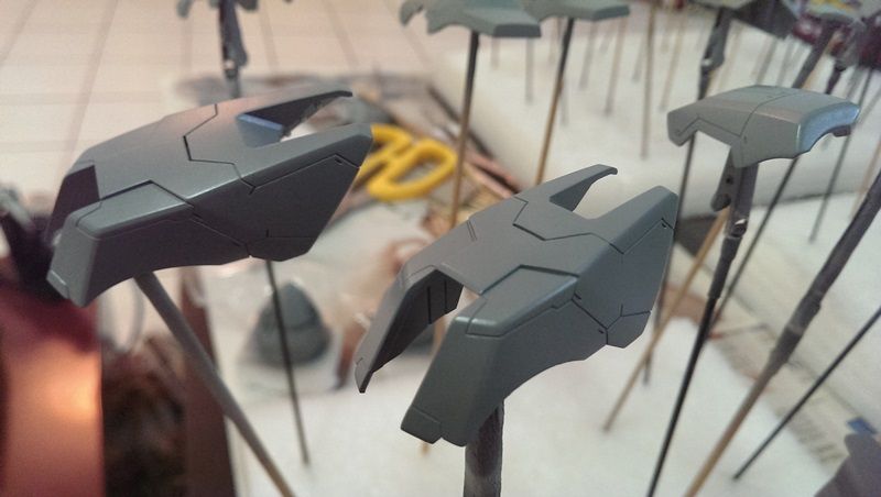 Color used: The left over of the grey color that I used from my previous build. Consists mostly of Mr Hobby Neutral Grey, Gaia Notes Neutral Grey III, with probably some Mr Hobby Midnight Blue in it. Step 2: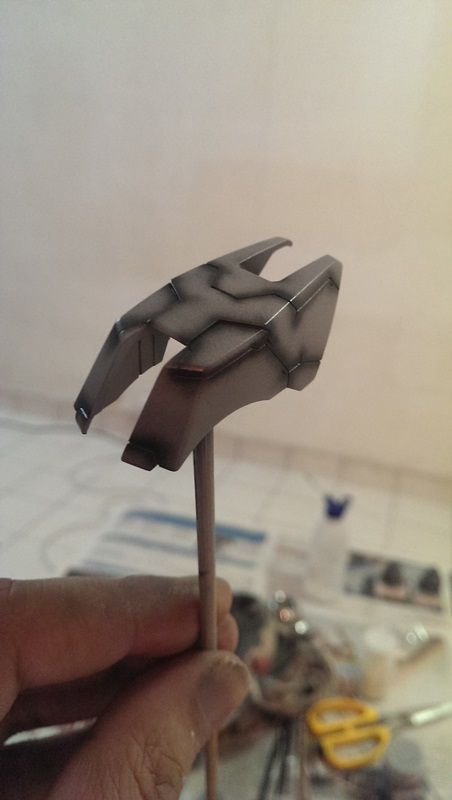 Color used: Mr Hobby Midnight Blue + little bit of fluorescent orange, airbrushed along the panel line. Step 3: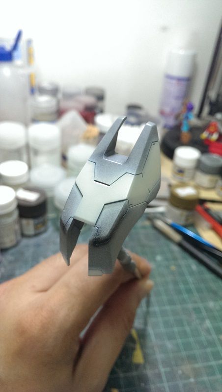 Color used: Gaia Notes Semi Gloss White + little bit of (Mr Hobby Character Yellow + Mr Hobby Neutral Grey + Mr Hobby Navy Blue + Mr Hobby Fluorescent Orange) Notes: The mixing of this color tone is really by experiment & result is determined by the What I See Is What I Get, so no precise formula here. Step 4: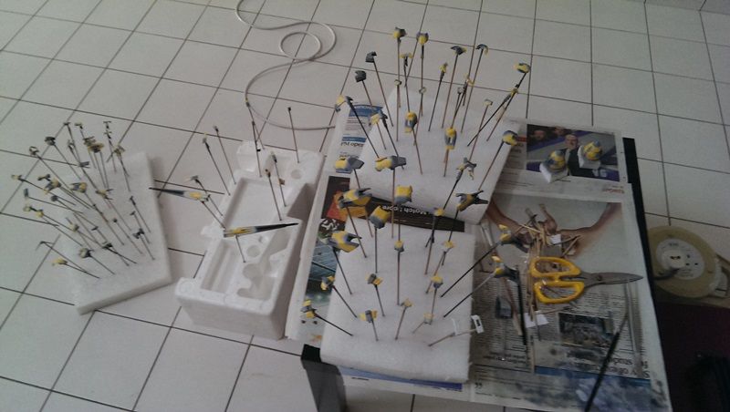 This is the masking step. The main purpose is to mask all the painted white so that the 2nd white tone will not overlap it. Reason for masking is because I'm not very precise with free hand. Time taken to do the masking is about 10 hours span over 2 days. Step 5 & Result: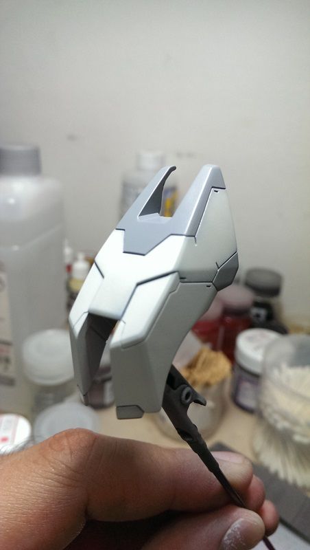 Color used: The 2nd white tone is the main white tone. The color used is Mr Hobby Character White + little bit of Mr Hobby Navy Blue + little bit of Mr Hobby Neutral Grey. Intermission: Mask all the painted section to prepare for the final color. Color used: The grey color initially was supposed to be the darker white, but somehow rather I felt that probably it should be more greyish to have it looks more interesting (it is rather a do or die). The color is Mr Hobby Character White + some Mr Hobby Navy Blue, then slowly adding in Mr Hobby Neutral Grey. Along the process I did add in Gaia Notes Neutral Grey III as well because the Mr Hobby Neutral Grey somehow rather not showing the result that I desired. Overal Feel: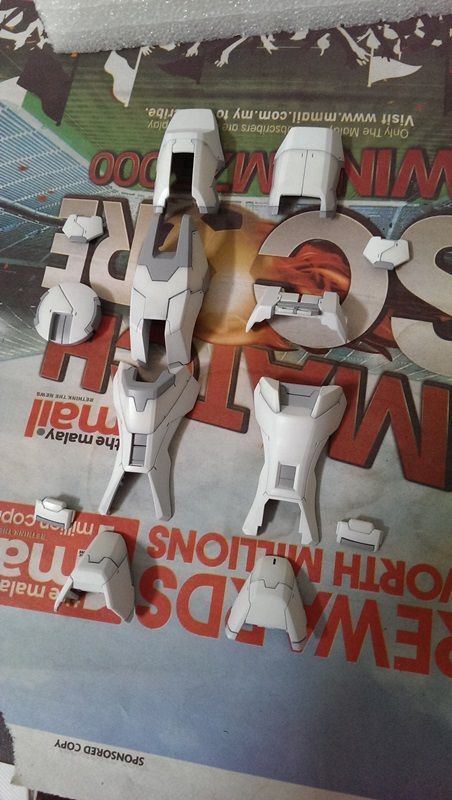 It's the first time that I do something like this, so I won't say that it's really that great, but it's pretty refreshing. I guess I have to wait until everything been put together only then could see how the final result is like.
|
|
|
|
Post by Phoon on Oct 2, 2013 17:07:02 GMT 8
Love the white and grey combo.....looks contemporary to me...keep it up bro!
|
|
|
|
Post by rennyd on Oct 7, 2013 12:48:43 GMT 8
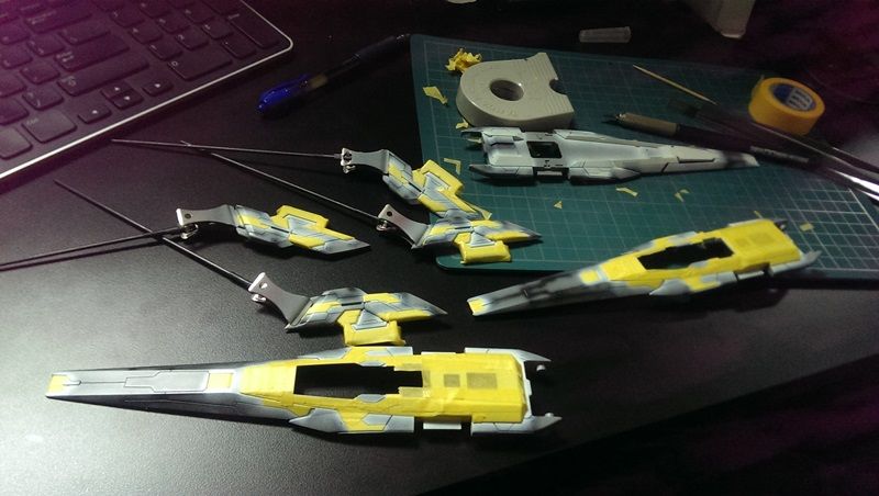
Update 2013-10-07 (GBWC 2013 Entries Submission Day)Ouch, I don't really want to be in such a situation again, rushing for competition is definitely something that I do not wish to do. So for the past 5 days, I've been trying to rush to get this kit done for the GBWC 2013. The remaining tasks are the painting of the blue, yellow and red, with each having 3 tones to be painted, much like the white armour parts, then the panel lining, the decal work, the top coat, the handling of the clear parts, and finally, my weak point; the display base... So the colours parts: 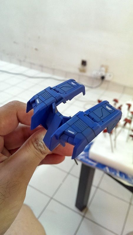 First tone: Gaia Notes Cobalt Blue + some Mr Hobby Midnight Blue + some Mr Hobby Neutral Grey + some Mr Hobby Fluorescent Pink. Second tone: Mr Hobby Cobalt Blue + some Mr Hobby Fluorescent pink 3rd tone: Gaiai Notes Cobalt Blue + Mr Hobby Intermediate Blue + some Mr Hobby Fluorescent pink. 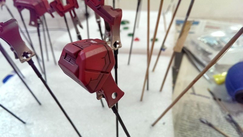 1st & 2nd tone: Left over from my previous PG Redframe + some Mr Hobby Flurosent center. 3rd tone: Gaia Notes Bright Red + some Mr Hobby Fluorescent Orange. 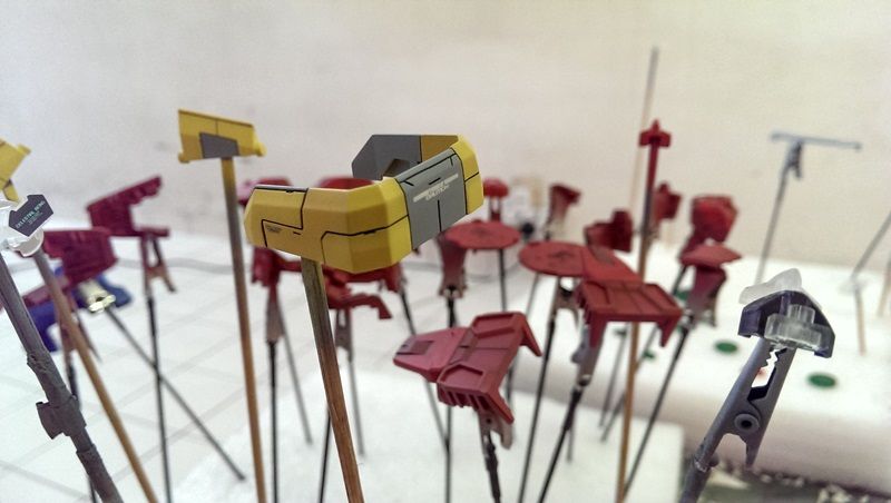 First tone: Mr Hobby Yellow + Mr Hobby Characther white. 2nd tone: Mr Hobby Yellow + Mr Hobby Character yellow. Grey: The grey from the white armour parts.  The clear parts are air brushed with Mr Hobby Shine Silver from the inside. So after all the panel lining work, and decal, finally able to have it done for the competition. Now I'll have to stop it here for a month at least before I continue with the O Raiser again. 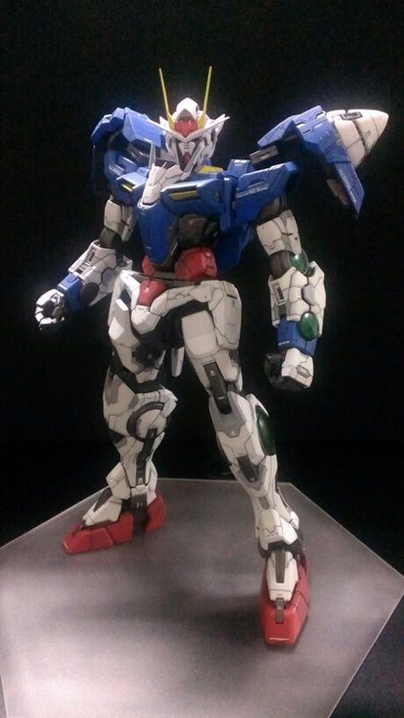
|
|
|
|
Post by Phoon on Oct 14, 2013 7:47:02 GMT 8
Honestly, this is one of my fav beside your Turn-A! Keep it up bro!
|
|
|
|
Post by GundamTS on Oct 14, 2013 17:40:54 GMT 8
Very nice
|
|
|
|
Post by rennyd on Feb 10, 2014 13:59:37 GMT 8
|
|
|
|
Post by rennyd on Feb 10, 2014 14:08:02 GMT 8
|
|
|
|
Post by neosigma on Feb 10, 2014 14:26:04 GMT 8
Renny you really giving me phobia and awe at the same time.......
Nice panelining on the O Raiser and the color is really RG like...
The BMC chisel and the Ceramic knife to make armor gap is one my next tool order list...issskkk...poison.....
|
|
shah
Newcomer

Posts: 81 
|
Post by shah on Feb 11, 2014 21:01:48 GMT 8
Fantastic looking model, and equally fantastic writeup/build log!
Can't wait to see it finished!
|
|
|
|
Post by tindustry on Feb 16, 2014 22:51:08 GMT 8
Superb work! The lines looks like they are molded on to the kit. Smooth and straight. This is no simple job!
|
|